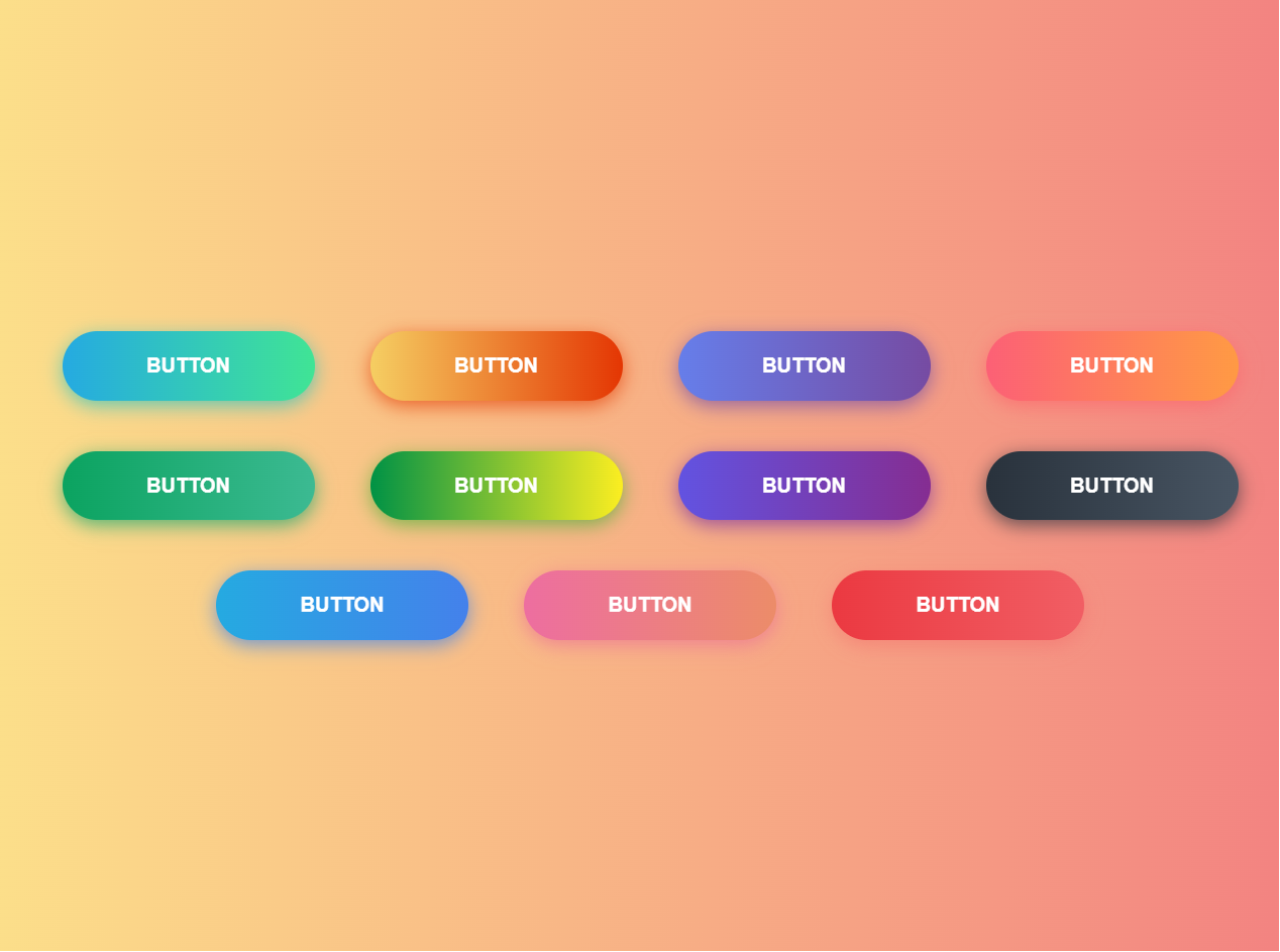
CSS Gradient Button Hover
CSS gradient buttons are a popular way to add visual interest and interactivity to websites. They can be used for a variety of purposes, including calls to action, navigation buttons, and more. In this article, we will explore the basics of creating CSS gradient buttons and provide some tips and tricks for making them look great.
Simple example
<div class="buttons">
  <button class="btn-hover color-1">BUTTON</button>
  <button class="btn-hover color-2">BUTTON</button>
  <button class="btn-hover color-3">BUTTON</button>
  <button class="btn-hover color-4">BUTTON</button>
  <button class="btn-hover color-5">BUTTON</button>
  <button class="btn-hover color-6">BUTTON</button>
  <button class="btn-hover color-7">BUTTON</button>
  <button class="btn-hover color-8">BUTTON</button>
  <button class="btn-hover color-9">BUTTON</button>
  <button class="btn-hover color-10">BUTTON</button>
  <button class="btn-hover color-11">BUTTON</button>
</div>
Custom style
To create a basic CSS gradient button, you will need to use the background-image property and specify the gradient values. Here is an example of how you might create a simple gradient button:
* {
  -webkit-box-sizing: border-box;
  -moz-box-sizing: border-box;
  box-sizing: border-box;
}

.buttons {
  margin: 10%;
  text-align: center;
}

.btn-hover {
  width: 200px;
  font-size: 16px;
  font-weight: 600;
  color: #fff;
  cursor: pointer;
  margin: 20px;
  height: 55px;
  text-align: center;
  border: none;
  background-size: 300% 100%;

  border-radius: 50px;
  moz-transition: all 0.4s ease-in-out;
  -o-transition: all 0.4s ease-in-out;
  -webkit-transition: all 0.4s ease-in-out;
  transition: all 0.4s ease-in-out;
}

.btn-hover:hover {
  background-position: 100% 0;
  moz-transition: all 0.4s ease-in-out;
  -o-transition: all 0.4s ease-in-out;
  -webkit-transition: all 0.4s ease-in-out;
  transition: all 0.4s ease-in-out;
}

.btn-hover:focus {
  outline: none;
}

.btn-hover.color-1 {
  background-image: linear-gradient(
    to right,
    #25aae1,
    #40e495,
    #30dd8a,
    #2bb673
  );
  box-shadow: 0 4px 15px 0 rgba(49, 196, 190, 0.75);
}
.btn-hover.color-2 {
  background-image: linear-gradient(
    to right,
    #f5ce62,
    #e43603,
    #fa7199,
    #e85a19
  );
  box-shadow: 0 4px 15px 0 rgba(229, 66, 10, 0.75);
}
.btn-hover.color-3 {
  background-image: linear-gradient(
    to right,
    #667eea,
    #764ba2,
    #6b8dd6,
    #8e37d7
  );
  box-shadow: 0 4px 15px 0 rgba(116, 79, 168, 0.75);
}
.btn-hover.color-4 {
  background-image: linear-gradient(
    to right,
    #fc6076,
    #ff9a44,
    #ef9d43,
    #e75516
  );
  box-shadow: 0 4px 15px 0 rgba(252, 104, 110, 0.75);
}
.btn-hover.color-5 {
  background-image: linear-gradient(
    to right,
    #0ba360,
    #3cba92,
    #30dd8a,
    #2bb673
  );
  box-shadow: 0 4px 15px 0 rgba(23, 168, 108, 0.75);
}
.btn-hover.color-6 {
  background-image: linear-gradient(
    to right,
    #009245,
    #fcee21,
    #00a8c5,
    #d9e021
  );
  box-shadow: 0 4px 15px 0 rgba(83, 176, 57, 0.75);
}
.btn-hover.color-7 {
  background-image: linear-gradient(
    to right,
    #6253e1,
    #852d91,
    #a3a1ff,
    #f24645
  );
  box-shadow: 0 4px 15px 0 rgba(126, 52, 161, 0.75);
}
.btn-hover.color-8 {
  background-image: linear-gradient(
    to right,
    #29323c,
    #485563,
    #2b5876,
    #4e4376
  );
  box-shadow: 0 4px 15px 0 rgba(45, 54, 65, 0.75);
}
.btn-hover.color-9 {
  background-image: linear-gradient(
    to right,
    #25aae1,
    #4481eb,
    #04befe,
    #3f86ed
  );
  box-shadow: 0 4px 15px 0 rgba(65, 132, 234, 0.75);
}
.btn-hover.color-10 {
  background-image: linear-gradient(
    to right,
    #ed6ea0,
    #ec8c69,
    #f7186a,
    #fbb03b
  );
  box-shadow: 0 4px 15px 0 rgba(236, 116, 149, 0.75);
}
.btn-hover.color-11 {
  background-image: linear-gradient(
    to right,
    #eb3941,
    #f15e64,
    #e14e53,
    #e2373f
  );
  box-shadow: 0 5px 15px rgba(242, 97, 103, 0.4);
}
License
MIT